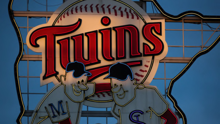
Late in the 2022 season, the Minnesota Twins announced that the team would be undergoing a “brand overhaul”, with new jerseys and a brand new logo ahead of the 2023 season, with a release date of November 18th. Today, the fans finally got to see what the new uniforms and gear would look like:
Inspired by the past. Built for the future. #AllTwins https://t.co/EdCBQ5n2ki pic.twitter.com/AiNNVXVW3t
— Minnesota Twins (@Twins) November 18, 2022
Given the fact that the team has completely changed how their jerseys look, it’s only fair that we break them down one by one and analyze their differences because there really is a lot to unpack here.
The Minnesota Twins unveiled their new logo and uniforms ahead of 2023.
We’ll start with the logo, as the team has moved away from the Kasota gold that had previously adorned the team’s jerseys, a move that is sure to make plenty of fans happy. It wasn’t thought of very highly and didn’t fit with the Twins’ color scheme in anyway. They also introduced a new secondary logo, highlighted by a North Star over a more straightened M (as seen on the caps).
For jerseys, the teams went with four very new looks. The all-white home jerseys (worn by Byron Buxton in the tweet) with the red lettering are simple and clean, and truly follow the team’s slogan of “Inspired by the past. Built for the future.” by mimicking a much-loved past look. It’s a simple, clean look, and even though an outline or pinstripes would look better, it’s still a solid look.
The team’s dark navy blue jerseys are also very simplistic, with the clean-cut block letters. Both have a Minnesota patch on the arm with the North Star over the Twins Cities (it matches the logo on the hat). It’s a very simple look, but it’s looks nice for a the team (and much better than the red ones).
They also brought back pinstripes as a part of their gray alternate jersey, which returns to the mix for the first time since they were taken out of the mix in 2018. Pinstripes have always been popular here, so to see them brought back is a welcome addition, especially with a jersey that brings back memories of the away jerseys from the 1990s.
Lastly, arguably the best of the new jerseys is the team’s new cream Twins Cities jerseys:
For the first time ever: Twin Cities. #AllTwins https://t.co/KklRxsdVK8 pic.twitter.com/Gw8e2iyXSf
— Minnesota Twins (@Twins) November 18, 2022
The first of any pro team in Minnesota to say “Twins Cities” on it, the cream-colored jerseys are extremely stylish and feature a pair of flags on the arms (one has an M for Minneapolis, the other an StP for St. Paul). They’re very impressive and offer a different look than what we’ve seen.
Overall, the general reaction seems to be generally positive from the fanbase, as the jerseys are not too overwhelming and too drastically different. It’s a good start to an offseason where the Twins should hopefully see some other changes as well.
