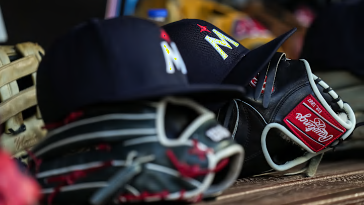
While the Minnesota Twins have existed in their current form since the 1960s, the team's logo hasn't really changed that much over the years. That all changed prior to the 2023 season when the Twins made the most significant changes to their logo since moving to Minnesota.
Over the years the Twins have most famously used a 'TC' logo, which has followed the team through its entire time in Minnesota. The other Twins logo you probably recognize is the cursive 'M', which was made famous during the late 80s and 90s thanks to players like Kirby Puckett.
The Twins haven't avoided change, and have tried to alter their logo to varying degrees. There was an all-red look the team donned in 1997 and the 2010s saw the team outline the 'TC' in gold trim.
Minnesota didn't abandon its classic logo with the recent changes, but the new primary logo was created to inject some new meaning into the franchise's history and its future.
Minnesota Twins logo explained
Starting with the 2023 season, the Minnesota Twins introduced a new logo and color scheme, the first major change the team made in decades. The classic 'TC' logo is still part of the rotation, but the team both brough back it's 'M' logo with a new twist.
The red star on the M logo and sleeve patch represents the North Star, another recurring motif in the design. That’s how they wanted to anchor the new M to representing Minnesota. pic.twitter.com/GxgaxB2b7m
— Do-Hyoung Park (@dohyoungpark) November 18, 2022
It's a controversial logo among fans, some of whom have embraced it while others continue to rail against its existence.
To be fair, there wasn't much wrong with the old 'M' logo, but it's rare that a team goes back to a logo it used to have without trying to modernize it a bit. In this case, the Twins went back to the drawing board entirely to reinvent the 'M' with a new meaning.
The design incorporates elements of the past, as well as the culture of Minnesota. The North Star above the 'M' is rather obvious and is something the Timberwolves have built into their new logo designs as well. The 'M' is a nod to the team's past, as it's the Washignton Sentors 'W' flipped upside down.
Before the Twins moved to Minnesota, they were the Washington Senators and count the team's history dating back to 1901. That's why the team will do things like Walter Johnson bobblehead days and such.
The Twins actually have a few new logos changes, not just the infamous 'M' on their hat. The Twins also changed their main logo and lettering this season as well.
A look at the new Minnesota Twins logo pic.twitter.com/THvzi8uy89
— Joon Lee (@joonlee) November 18, 2022
The Twins still wear their iconic 'TC' logo on a regular basis, but the cursive 'M' seems to be gone forever. Perhaps it will make a special appearance here or there, but the North Star reverse 'W' logo is the new logo for the next generation.
