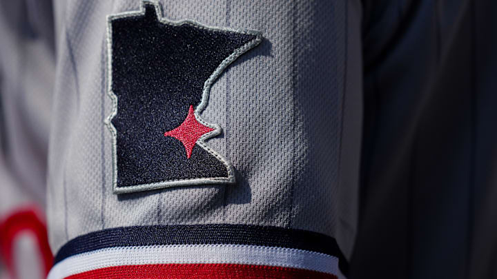
Last season the Minnesota Twins revealed new uniforms that radically updated the team's look for hte first time in years. The results were initially mixed, and folks still have gripes about some specifics, but generally the new look for the team was embraced by fans.
Some fans took issue with the pinstripes on the road uniforms remain sticking points for some fans, but nothing was more polarizing than the new 'M' logo the Twins rolled out.
A year later we're set to do it all over again.
On Tuesday, MLB announed that nine teams were going to get a City Connect jersey this upcoming season. The Twins were on the list, which means while the look won't be getting overhauled again fans will have another uniforms to look at, wear, and likely debate at great lengths.
Nine teams are getting City Connect uniforms this year 👀
— MLB (@MLB) February 13, 2024
Which teams are you looking forward to most? pic.twitter.com/RV9iXLuwts
This will be the first time the Twins are getting a City Connect jersey, which shouldn't be confused with the cream 'Twin Cities' uniforms they wore last season. Those are just third alternates to go with the home whites and road pinstripes, and this City Connect will be a fourth that the team works into the rotation.
What will Minnesota Twins City Connect jersey look like?
This is the big question.
We've seen what the spectrum of City Connect uniforms looks like, with the White Sox and Angels uniforms being among the best while the Cubs are an example of what mailing it in looks like.
The NBA has been doing these for years, so perhaps a glimpse at some of what the Timberwolves past 'City Edition' uniforms look like could help give us an idea of what the Twins will end up with. If that's the case, this is a perfect opportunity to incorporate a Prince jersey into the mix just like the Wolves did with their first City Edition uniforms.
Timberwolves City Edition jerseys with the Purple Rain vibes 💯 pic.twitter.com/mXCIu5BVoG
— Mickstape (@MickstapeShow) November 1, 2018
Essentially, the City Connect uniforms will be more about state pride than specifically being tied to Minneapolis. It's far more likely that the Twins City Connect uniforms resemble something closer to what the Timberwolves are wearing this year, which is supposed to represent elements of identity across the state -- lakes, cold weather, etc.
Check out the Minnesota Timberwolves brand new lake-inspired "City Edition" uniforms for 2023-24
— Chris Creamer | SportsLogos.Net (@sportslogosnet) August 15, 2023
Story, details, more pics here: https://t.co/kuH3JXaNUV pic.twitter.com/thGvWAISQ8
It's also an opportunity for the Twins to take a look back and incorporate the franchise's history into the new uniform. Perhaps this is where we get something closer to the classic 'M' than the new one that everyone seems to loathe so much.
The White Sox nailed their uniforms by embracing the idenity of the South Side of Chicago, while the Angels went for a blast from the past fused with some surfer vibes. The Padres went wild with theirs and the Nationals also went for it and saw positive results.
Here's to hoping the Twins follow that path and get creative with their City Connect uniforms and don't fall into the trap the Cubs or Dodgers did with theirs.
