Minnesota Twins: Ranking the Twins’ best uniforms of all-time

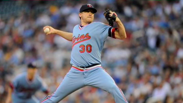
MINNEAPOLIS, MN - JUNE 5: Kevin Correia #30 of the Minnesota Twins delivers a pitch against the Milwaukee Brewers during the first inning of the game on June 5, 2014 at Target Field in Minneapolis, Minnesota. (Photo by Hannah Foslien/Getty Images)
1 of 11
Next
MINNEAPOLIS, MN – JUNE 5: Kevin Correia #30 of the Minnesota Twins delivers a pitch against the Milwaukee Brewers during the first inning of the game on June 5, 2014 at Target Field in Minneapolis, Minnesota. (Photo by Hannah Foslien/Getty Images)
MINNEAPOLIS, MN – JUNE 5: Kevin Correia #30 of the Minnesota Twins delivers a pitch against the Milwaukee Brewers during the first inning of the game on June 5, 2014 at Target Field in Minneapolis, Minnesota. (Photo by Hannah Foslien/Getty Images) /

The Minnesota Twins announced they will bring back their baby blue road uniforms this week, but which jersey goes down as their best?

For the Minnesota Twins, they understand that if you look good, you play good. Some will disagree with that statement since the team coated everything in Kasota Gold over the past couple of seasons, but earlier this week, the Twins announced that they are bringing back their baby blue road uniforms as an alternate for the 2020 season.

Those uniforms may not be able to satisfy those who just want to see a brand new starting rotation throw the baby blues on, but it opens the door to what is old that’s becoming new. In advance of the Twins’ 60th season in Minnesota, it begs the question of which uniform combination was the best the Twins have thrown on and (even better) which ones will be the worst?

Before we get started on this list, there are a couple of things you should know. Some of the uniform combinations are connected with the other, so there are a couple that are lumped together. In addition, we won’t be doing special uniforms such as the “Turn ahead the clock” uniforms that the Twins wore in 1998.

Regardless, there are plenty of great uniforms that have been worn throughout Twins history and we’ll try to take a look at which one was the best.
/

10. 2016-Present red alternates

If there’s going to be one constant in this list, it’s going to be a pure hatred for Kasota Gold. The Twins introduced the gold lining to several of their jerseys prior to the 2015 season and in 2016, the Twins took this one step further by creating a red jersey that came straight out of hell.

The gold lining around the neck is a little distracting, but the giant TC logo draped in gold makes me long for the straight-up white and blue TC logo that’s used on the caps during the 1970s (more on these later in the list).

Perhaps the one thing that really drives these down, however, is the blue numbers and lettering outlined by white and gold. Maybe if the Twins had gone with just blue and white numbers (like the Cleveland Indians did in their red alternates that debuted last season), it would look OK. But with the gold outline thrown in, there’s just too much going on.

9. 1997 Red Alternates

If there’s a special place in hell reserved for the Twins’ current red jerseys, the ones introduced in 1997 aren’t far behind. I’m not sure why, but if the red isn’t on the Twins cap, it just seems like overkill for the simplicity that the Twins uniforms have brought over the years.

These jerseys were brought in as a Sunday alternate for the Twins but didn’t have the same sharpness as the blue jerseys that were introduced the same year and lasted for nearly a decade. The Twins’ first iteration of red jerseys lasted just two games and according to a 2012 story from Fox Sports North, Ron Coomer revealed that manager Tom Kelly wasn’t a fan of the jerseys either.

“I knew after the second game we wore them in we’d never wear them again,” Coomer said. “Tom ripped his jersey off, and you knew he didn’t wanna wear it — none of us did; it didn’t look good…they definitely had the Dairy Queen colors. We said we looked like we worked at Dairy Queen.”

Although Dairy Queen has been a constant sponsor for the Twins over the years, bringing that color on the field wasn’t the best of decisions. While there is a valid argument for putting this behind the current red jerseys, Kasota Gold puts this one slightly ahead.

MINNEAPOLIS, MN – MAY 02: (L-R) C.J. Cron #24, Jonathan Schoop #16 and Byron Buxton #25 of the Minnesota Twins celebrate defeating the Houston Astros after the game on May 2, 2019 at Target Field in Minneapolis, Minnesota. The Twins defeated the Astros 8-2. (Photo by Hannah Foslien/Getty Images)
MINNEAPOLIS, MN – MAY 02: (L-R) C.J. Cron #24, Jonathan Schoop #16 and Byron Buxton #25 of the Minnesota Twins celebrate defeating the Houston Astros after the game on May 2, 2019 at Target Field in Minneapolis, Minnesota. The Twins defeated the Astros 8-2. (Photo by Hannah Foslien/Getty Images) /

8. 2015-Present Home

Here we have another addition to the Kasota Gold jerseys. While this jersey was the official throwaway to the pinstriped jerseys that followed the Twins since 1987 (although they were tweaked in 2010), it just seems off thanks to the gold outline and the blue logo and letters across the back.

Of course, the biggest highlight was the introduction of Kasota Gold to the Twins color scheme which originally debuted as part of the jerseys for the 2014 MLB All-Star Game at Target Field. As always, Twins president Dave St. Peter had a positive spin on adding gold to the scheme.

“The Twins have a proud tradition and believe the team’s uniforms have long been among the best in baseball,” St. Peter said upon the home jersey’s introduction in 2015. “We are excited to introduce a new contemporary primary home uniform which evolves our brand via the introduction of a gold accent color representative of our home state, as well as our home ballpark.”

If there’s one saving grace here, it’s that the gold outline on the Twins’ alternate hats look pretty sharp, but otherwise the gold falls flat and the jersey just looks too plain to be one of the better ones in Twins’ history.

MINNEAPOLIS, MN – JULY 20: Miguel Sano #22 of the Minnesota Twins celebrates hitting a solo home run as he rounds the bases against the Oakland Athletics during the seventh inning of the game on July 20, 2019 at Target Field in Minneapolis, Minnesota. The Athletics defeated the Twins 5-4. (Photo by Hannah Foslien/Getty Images)
MINNEAPOLIS, MN – JULY 20: Miguel Sano #22 of the Minnesota Twins celebrates hitting a solo home run as he rounds the bases against the Oakland Athletics during the seventh inning of the game on July 20, 2019 at Target Field in Minneapolis, Minnesota. The Athletics defeated the Twins 5-4. (Photo by Hannah Foslien/Getty Images) /

7. 2019-Present Blue Alternates

Out of all the Kasota Gold jerseys, this one may be the one I can tolerate the most. The Twins introduced their most recent blue alternate jerseys last year and although it has a healthy dose of gold around the Twins script on the front and the player and numbers on the back, there’s always a battle in my mind whether I like them or not.

The front of these jerseys look pretty sharp as the gold helps the Twins script pop and the piping around the jersey is actually tolerable compared to some of its counterparts. The part that gets me is the back where the numbers look bloated with the gold outline and almost give it the look of caffiene free Diet Pepsi.

Again, these are probably the most tolerable of the current jerseys, but they may not be the best thanks to their most recent blast from the past.

6. 2006-10 sleeveless alternates

Sometimes just because something hasn’t been done does not mean that it should be done. While the Twins’ jerseys during the Metrodome era have a special place in the hearts of Twins’ territory, the addition of an alternate sleeveless jersey in 2006 just seemed like overkill.

Perhaps this is a minor gripe as teams like the Kansas City Royals and Cincinnati Reds were also using sleeveless jerseys at the time, but the blue sleeves underneath didn’t seem to mesh well with the Twins’ pinstripes. With no option to go full Rick Vaughn, the jerseys actually made a prolonged run of five seasons before being retired after the first season at Target Field.

Perhaps the sleeveless jerseys are this low because of the era in which they were brought in. From 2006-10, the Twins saw the departure of Johan Santana and Torii Hunter as well as the deflating 2006 ALDS sweep from the Oakland Athletics. Mix in the acquisitions of Delmon Young and Brendan Harris and these jerseys are almost too depressing to think about.

/

5. 2010-Present road (and alternates)

Now that we’re past gimmicks and Kasota Gold, we get into some of the jerseys that stick with the traditional blue and red color scheme. To lead off this group, we have the Twins current road gray jerseys which had a blue alternate version added prior to the 2011 season.

To be honest, these are nowhere near the Twins’ worst jersey, but they were all to similar to another MLB road jersey at the time. The Washington Nationals had a very similar script on the front of their jerseys for a city name and although the Twins began using the jerseys with just blue lettering for the first couple seasons, a red outline was added a couple years later that made the names pop, but again seemed like overkill.

To be fair, it’s very hard to make a gray jersey something that people are fond of and as Nike has rolled in making a yellowish alternate for the San Diego Padres this season, it’s possible they could be shifting away from that in the coming years. The current road jerseys are fine, but if they came up with a different style in the next couple of years, I wouldn’t shed any tears.

24 Aug 1997: Infielder Chuck Knoblauch of the Minnesota Twins in action during a game against the Baltimore Orioles at Camden Yards in Baltimore, Maryland. The Orioles won the game, 5-1. Mandatory Credit: Doug Pensinger /Allsport
24 Aug 1997: Infielder Chuck Knoblauch of the Minnesota Twins in action during a game against the Baltimore Orioles at Camden Yards in Baltimore, Maryland. The Orioles won the game, 5-1. Mandatory Credit: Doug Pensinger /Allsport /

4. 1997-2013 Blue Alternates

While the red alternates had an extremely short life span before being set ablaze with a Tom Kelly cigar, the blue jerseys that were also introduced that season enjoyed a very long shelf life.

The Twins not only had several iterations of their blue alternates, which originally contained the traditional Twins script at home and a block Minnesota for the road, but the jersey also endured several tweaks as the Twins moved into Target Field.

While the original designs from 1997 are long gone, the Twins blue jerseys have evolved to have the current Minnesota script on the front and have steered clear of the dreaded Kasota Gold curse until last season when the Twins pretty much threw everything together and hoped for the best.

In all, the blue alternates were the first attempt at creativity for the Twins uniforms outside of the traditional home and away sets and as Minnesota continues to crank out blue jerseys through the years, it has to be considered a success.

Minnesota Twins
Minnesota Twins /

3. 1973-86 Home & Road

The brainchild of the Twins latest alternate uniforms in 2020, the 1973-86 home and road uniforms didn’t feature a lot of winning, but at least the Twins looked good while they were getting shelled all across the American League.

In the case of the home jersey, the colors were simple. While the Twins had gone with an even simpler look for their first 12 years into the league, the Twins added more blue and red to the jersey along the sleeves and waistband and ditched the pinstripes for a new look.

Unlike the current jerseys without pinstripes, there were more to these jerseys and with legends such as Kirby Puckett and Kent Hrbek donning them during the early years of their career, a lot of fans reach for these when trying to make a statement at the ballpark.

The same can be said for the powder blue uniforms that have made their comeback into the current Twins set. While I’m not a fan of the powder blue pants that come with it, the tops are magnificent even if they followed a trend set by the Kansas City Royals (who wear it even better) and the St. Louis Cardinals during those same seasons.

Powder blue isn’t even in the Twins’ color scheme, but for whatever reason, it works here. Even though Nike is charging a ridiculous $334 to bring one of these home, it might be one of the Twins’ best current uniforms.

MINNEAPOLIS – OCTOBER 06: Joe Mauer #7 of the Minnesota Twins circles the field after the Twins defeated the Detroit Tigers to win the American League Tiebreaker game on October 6, 2009 at Hubert H. Humphrey Metrodome in Minneapolis, Minnesota. (Photo by Jamie Squire/Getty Images)
MINNEAPOLIS – OCTOBER 06: Joe Mauer #7 of the Minnesota Twins circles the field after the Twins defeated the Detroit Tigers to win the American League Tiebreaker game on October 6, 2009 at Hubert H. Humphrey Metrodome in Minneapolis, Minnesota. (Photo by Jamie Squire/Getty Images) /

2. 1987-09 Home & Road

I’m putting these two uniforms together because they represent two of the most successful eras in Twins history. For starters, these uniforms debuted right before the 1987 season where the Twins won their first World Series and then turned around and won their second in 1991.

Although these were worn throughout the rest of the lean seasons for the rest of the 90s, they made a return to prominence thanks to Torii Hunter, Justin Morneau and Joe Mauer among others as the Twins captured six American League Central division titles between 2002 and 2010.

I could be biased since these jerseys were a large part of my childhood, but when I think of the Twins, I think of the red script on the front with the pinstripes. Heck, even the lettering on top of the scoreboard mimics the one seen on these jerseys, which cement the iconic place they have in the history of the franchise.

They may be simple, but these jerseys are the ones that represent some of the most iconic teams and names in franchise history.

MINNEAPOLIS, MN – AUGUST 1: Tony Oliva, former player with the Minnesota Twins, shakes hands with former teammates Frank Quilici and Jim Kaat during a ceremony honoring the 1965 American League Championship team before the game between the Minnesota Twins and the Seattle Mariners on August 1, 2015 at Target Field in Minneapolis, Minnesota. (Photo by Hannah Foslien/Getty Images)
MINNEAPOLIS, MN – AUGUST 1: Tony Oliva, former player with the Minnesota Twins, shakes hands with former teammates Frank Quilici and Jim Kaat during a ceremony honoring the 1965 American League Championship team before the game between the Minnesota Twins and the Seattle Mariners on August 1, 2015 at Target Field in Minneapolis, Minnesota. (Photo by Hannah Foslien/Getty Images) /

1. 1961-71 Home

While the Twins jerseys of my childhood were something to behold, the original Twins uniforms may have been even better. With a blue cursive Twins script on the front, these uniforms helped usher Major League Baseball to Minnesota and with names such as Harmon Killebrew, Tony Oliva and Jim Kaat, the Twins saw their first taste of success in them as well, winning the 1965 AL pennant.

The cream-colored uniforms give these an old school feel that still looks cool today and when the Twins moved to Target Field in 2010, the uniforms became part of their normal rotation until being retired prior to last season.

One of the best things about these jerseys is the lack of a name on the back and although that may mean less money in the pro shop (considering Twins fans wouldn’t have to buy a new one when their favorite player got too expensive), they actually match the limestone surrounding the ballpark better than the Kasota Gold that has been forced upon Twins fans.

Next. Could Zack Wheeler be the ace the Twins need?. dark

If there’s one jersey that should make a comeback in the next few years, it’s this one, but with a trend towards newer, flashier jerseys, Twins fans will probably be left holding their breath.

Next